Showing posts with label OBIEE. Show all posts

Sunday, 26 August 2012

A chart is worth a thousand words - only when it's used appropriately (Part 2)

Charts are informative and widely adopted in Business Intelligence. However, sometime they are misused and generates no business insights but confusion. In my last post, we've discussed about Line Chart and Pie Chart. Today let's continue the same topic by examining map, gauge and Trellis.

Map Chart

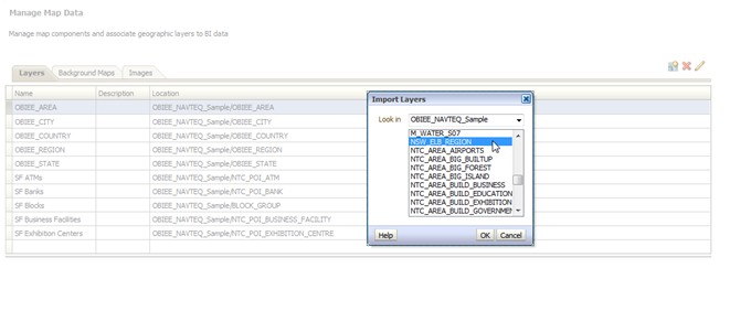
Maps have been used to visualize information since the early phase of human civilization. Now in the recent years, thanks to the digitalization of maps more and more quantitative analysis of location related information can be performed on top of map. Furthermore, with powerful spatial systems such as Oracle Spatial, the business intelligence users can bring the spatial analysis to another higher level by invoking advance spatial functions such as topological operators or distance operators. In one of my previous posts, I briefly went through how spatial analysis can be achieved with OBIEE's integration with Oracle MapViewer, Oracle Spatial and digital map services such as Navteq or Google.

However, just because you can now display quantitative data on a map doesn't mean you should in every case. the location of something or its proximity to something else is not always useful information for analysis. But in some cases, it is critical to display data on a map.

In the example below, we color coat sales volume for individual stores on a floor-plan map. Intuitively, the correlations between store value and environment factors are revealed. How significantly is a food court attracting customers for stores nearby? Is it true that shops next to lifts will always have more customer visits than those far from lifts? Is that necessary to have baby feeding room on each floor of the shopping mall? With conventional views such as pivot table or bar chart, none of these can be easily presented.
Business Intelligence on Floorplan

In contrast, placing pie chart to indicate the state of sales for different products in regions on a map of the United States as shown in the next example adds no value. Firstly it's nearly impossible to tell the differences between products on a tiny pie chart, secondly a simple table with sales group by product and region would have provided the information more directly.
Pie chart is not helpful on Map

Gauge Chart

Gauge is normally used to show a single data value of key performance indicators (KPIs). Due to its compact size, a gauge is often more effective than a graph for displaying a single data value. Gauges identify problems in data. A gauge usually plots one data point with an indication of whether that point falls in an acceptable or unacceptable range. Thus, gauges are useful for showing performance against goals.

Depending on the data in the analysis, a gauge view might consist of multiple gauges in a gauge set. For example, if you create a gauge view to show the sales data for the last twelve months, the gauge view consists of twelve gauges, one for each month. If you create one to show the total sales in the US, then the gauge view consists of one gauge.

Gauge is the best candidate for displaying KPIs

However, if the objective is not for comparing against goal that's broken down into ranges, but for seeing the precise differences between values, Bar Chart is still a better choice.


Trellis Chart

It is often helpful to divide the data set we wish to examine into multiple graphs, either because we can't display everything in a single graph without restoring to a 3D display, which would be difficult to decipher, or because placing all the information in a single graph would make it too cluttered to read. By splitting the data into multiple graphs that appears on the screen at the same time in close proximity to one another, we can examine the data in any one graph more easily, and we can compare values and patterns among graphs with relative ease. This is referred by people as Trellis Chart.

The trellis chart, which was introduced in recent OBIEE 11.1.1.6.2 BP1 release, is the same as a pivot table—with one major exception: the data cells within the trellis contain graphs. Whereas a stand-alone graph type such as a single bar graph or a single scatter graph works on its own, the trellis graph works only by displaying a grid of nested graphs, known as inner graphs. So a bar-graph trellis view is actually comprised of multiple bar graphs.

Let's have a look at an example. We need to analyze the trend of monthly net cost of sale by product by region. Giving only 8 different offices and 4 products, we will will have the combination 32 lines stretching along the X-axis of time dimension. Obviously the chart will be too dense to read if everything is placed on one graph. But even if we break it into sections by products, we will end up with 4 clumsy line charts which won't be fit on one web page and not very readable individually.
Information overflowing on line chart

On the other hand, if we use Trellis Chart to present the same amount of information, by separating each region and product, we can now compare the correlation pattern formed by each group and more easily spot the differences. Trend lines for net sale costs for 18 months, 8 offices and 4 products are clearly visualized on one pivot table which can be examined by users with no scrolling through multiple pages.

Trellis Chart
In summary, the ultimate objective of BI visualization is for helping people to see, understand and digest information. As data visualization tool, graphical charts will only fulfill their functionalists if you can choose them wisely for different underlying data and business purposes.


Sunday, 6 May 2012

A chart is worth a thousand words - only when it's used appropriately (Part 1)

People love charts and graphs. They are intuitive, less intimidating (compare with big fat spreadsheet) and more informative. However, every now and then, I've seen people force data into unsuitable charts, not for revealing business insight purpose but for just having some color and graph on their BI reports. In those cases charts provide no value add but duplication or confusion, in terms of analysis. In this post, I will examine a few OBIEE chart types which I believe are important but sometime not used in the most appropriate way by end users.

Line Chart

Lines work better than any other means to make visible the sequential flow of values as they have changed with the passage of time. So, Line Chart will be the best choice if your objective is to see how quantitative values have changed during continuous period of time (in another words time series analysis). Time series analysis majorly reveals patterns such as Trend, Variability, Rate of Change, Co-variation, Cycles etc. Today I will do a bit drilling on Trend and Rate of Change.

A trend is the overall tendency of a series of values to increase, decrease or remain relatively stable during a particular period of time. For example, it is common to refer to sales revenue during a 12 months period as trending upward, downward or remaining flat. Trends are often obvious from the general slope of a line, but when the line moves both up and down throughout the period, the overall trend might be difficult to determine based on the appearance of the line alone. At such times, you should consider to use moving average function on the measure for Y axis so that a more obvious trend line can be visualized on the chart.

On the example chart below, the weekly numbers of orders for year 2008 are fluctuating therefore it is not easy to tell the trend from blue spiky line. But when I add Moving Average result of order number as derived measure and display it as red line on the chart, a much more obvious Bell Curve reveals the trend for my customer's order pattern.
Trend Line

Moving Average function in OBIEE Answers
The Rate of Change from one value to the next can be directly expressed as the percentage difference between the two. It is often enlightening to view change in this manner, especially when comparing multiple series of values such as sales per region. However, when the measure values being compared are in different order of magnitude, the slope of lines will become misleading and may make people draw wrong conclusion for the comparison between rates of change. For an instance, in a graph with a standard linear scale, the slope of a line that increased from $1000 to $1100 is less steep than on that increase from $10000 to $11000. Although the rate of change for both are 10%, our eyes will make us believe the growth rate for the second measure($10000) is quick than that for the first one($1000). In this case, we can create the line chart with a logarithmic scale. Using a lot scale, the rate of change will appear as accurate slope, no matter how much the actual values are or how great the difference between them.

Look at the example below, this line chart shows the comparison of Rate of Change between revenue and billed quantity of product for the first half of year 2008. When the line char is drawn with default scale, people will easily jump into the conclusion that the growth rate of revenue is much faster than that of product billed quantity.
Rate of Change Default Scale

However, when I use Logarithmic scale to display same underlying data, the graph contains two lines that exhibit precisely the same visual patterns and slopes, which reveals that the rate of change for revenue and billed quantity are the same.
Logarithmic Scale in OBIEE Answers

Rate of Change Log Scale

Pie Chart

Pie chart is also wildly adopted in the reporting world. Every year when I receive the government spending report for my local city council, pie chart is everywhere. Pie char is commonly used to display part-to-whole relationships. Without need to move eye sight around, the report reader can quickly identify which group contributes/consumes the largest/smallest slice of the pie. Look at the example below, this chart shows the operational costs associated with customers from different industries. Just at a glance, I can reach the conclusion that among all the customers, Government generates more than a quarter of the total cost while Distribution only contributes less than 5% of it.
Pie Chart


Pie chart is very intuitive in terms of revealing the top and bottom player in a whole. However, Pie Chart still has a deadly defect which make it very confusing under some circumstances. Let's look at the same example chart and ask this question: what is the difference between categories "Commercial", "Industrial" and "High Tech"? It's not easy for an ordinary users isn't it? The user needs to compare the 2D areas or the angles formed by the slices, but human being's visual perception doesn't accurately support either of these tasks very well. On the other hand, the difference between those three "close competitors" will be much more obvious if the same information was put on a Bar Chart, as we are normally good at comparing 1D lengths.

What if I want to not only leverage the advantage of Pie Chart (quickly reveals the part-to-whole relationship for "winner" and "loser") but also minimize the defect of it (challenges human being's capability of identify insignificant differences on 2D areas or angles)? A proper setting of data label on Pie Chart can probably help achieve what we want.
Data Label setting in OBIEE Answers

Pie Chart with percentage data label

In the next coming one, I will discuss about the features, tips and best practice of another three OBIEE chart types. Please stay tuned.

Monday, 23 January 2012

Minority Report


Ranking is a very usual requirement of BI reporting. People tends to sort things in order and focus on the top performers. Which sales region is generating the most of revenue? What are my most popular products? Who are my best performing employees? All these type of queries can be easily answered via invoking the Rank() function on relevant fact measure.
What about "the other 80%" (Pareto Principle)? We normally are not interested in the details of "insignificant" individual contributors. But the overall collective contribution of "the others" can be very valuable business information. One example can be risk control. From the management's perspective, the bigger contribution "the others" generate, the lower risks the business will have.

Here I would like to share with you two different apporaches for composing this kind of minority report in OBIEE 11g.

 I will be using the data and subject area "Sample Sales" from OBIEE SampelApp.


The first approach leverage CASE function and attribute column.
1, Create a new analysis with subject area "Sample Sales', drag in the column "P1 Product" and "1 - Revenue" twice.


2, Put the following code in the column formular of the second "P1 Product". Change the column title to "Top Individuals".

case when rank("Base Facts"."1- Revenue")<=5 then "Products"."P1  Product" else 'All other Non Toppers' end

3, Put the following code in the column formular of the second "1 - Revenue". Change the column title to "Rank". Add "sort acending" on this column.

case when rank("Base Facts"."1- Revenue") <= 5 then rank("Base Facts"."1- Revenue") else 6 end

4, Open the column formula for "Rank", tick the box for "treat as attribute column". This setting specify the column to be handled as an attribute column, which prevents the aggregation of the values. For the detail explanation of "attribute column", you can click on here and go one page up.


5, Go to the result tab, and add a new pivot table view. Click on the pencil button to modify the view and make it's defined like below.


6, Then you get your "minority report". You can also create a chart to get some intuitive views.

7, The only flaw of this apporach is Table view wouldn't give us the result we want. Once column "P1 Product" is exclude from the layout, the table aggregate everything into one record. This is because of the limit of "attribute column" function. More explanation can also be find from the document link mentioned in step 4.


The second approach is more straightforward in my point view. Instead of retrieving everything from database and then rely on the CASE function to categorize records on the presentation layer, This approach will retrieve "Top 5" and "Non Top 5" as two separate data set from database directly. Then uses the "combine function" in Answers to combine the data sets together as report result.

1, Create a new analysis with subject area "Sample Sales', drag in the column "P1 Product" and "1 - Revenue" twice.


2, Put the code below as the column formular of the second " 1 - Revenue" column. Change the column title to "Rank".

Rank("Base Facts"."1- Revenue")

3, Add a filter on column "Rank".


4, Below the save button, click on "combine results based on ..." button to add another set of criteria. Chose the same "Sample Sales' subject and add same columns in criteria.


5, Put the code below as the column formular of the second "P1 Product". Change the column tilte to "All other Non Toppers".

'All other Non Toppers'

6, Put the code below as the column formular of the second " 1 - Revenue" column. Change the column title to "Rank".

Rank("Base Facts"."1- Revenue")

7, Add a filter on column "Rank".


8, Click on "Result Column" and add sort ascending on column "Rank".

9, Click on the result tab and click on pencil button to modify the table view. Exclude column "P1 Product" from the table layout.

This approach works well with both table view and pivot table view.


In summary, I think the key learning from this practices is:
 1, Attribute Column is your friend when you want to avoid the aggregation on certain column;
 2, Don't forget about the "combine result" button on top right of your Answers interface. It helps a lot in certain circumstances.

Sunday, 15 January 2012

Miss is as good as a mile

A few days ago, I was reviewing my prior post and something unusual caught my attention.

How come those densely populated suburbs in Sydney are not covered by the thematic view for postal areas??? In order to further confirm the issue, I moved the map around to another state and I found some thematic views are put on Tasman sea (see below)!!! I've got an alignment issue.
This is a critical issue for a BI Mapview as Business Intelligence are not accurately aligned with the real location on map. A few centimeters shifting of map theme (geometries that represents regions) on Google Map will make users look at the business information that is actually relevant with area/spot a few kilometers away. This makes the whole spatial analysis meaningless.

After spending some time searching and studying, I found the root cause of this problem - the inconsistency between SRIDs for Google Map and spatial data in database. SRID represents "Spatial Reference system IDentifier" which is a unique value used to unambiguously identify projected, unprojected, and local spatial coordinate system definitions. These coordinate systems form the heart of all GIS applications. Older map uses old reference system while newer maps use more accurate reference system made using satellites and sophisticated electronic equipment. The coordinates for a point on the earth can vary significantly depending on the SRID used. Consequently, if all spatial data is not in the same spatial reference system, the geographic layers will not overlay and the analysis will become misleading.

In our case, the map service provider Google is using SRID 3785.
 However,when import spatial data from shapefiles into Oracle database, the SRID is set to 8307 by default. It can be retrieved by running the SQL Script below:

select table_name, column_name, srid from user_sdo_geom_metadata
where table_name = 'NSW_ELB_REGION';

Because it's not practical for us to change the SRID of Google Map, we need to do something on our spatial data in Oracle database so that it is compatible with SRID 3785.

In Oracle Spatial Developer's guide, three approaches are suggested for fixing this issue:
1, Use SRID 4055 data;
2,   Declare an EPSG rule between SRID 8307 and 3785;
3,   Call oracle stored procedures to convert spatial data that physically stored in database;

I've tested the first two approaches in my environment. Either of them fixed the alignment issue perfectly for me.

For the first approach, all you have to do is specify the SRID value as 4055 while import the shapefile data with Oracle Mapbuilder (step in my last post). Then the data will be loaded into Oracle database as SRID 4055 which is compatible with Google's SRID 3785.

However, if reloading the data is not a feasible option for you, you can run the following SQL script to declare a transformation rule between SRID 8307 and 3785. As the result, when Oracle retrieve the spatial data that you loaded, it will apply the rule to transfer it to SRID 3785 and send it to Oracle Mapviewer for rendering.
CALL sdo_cs.create_pref_concatenated_op(830723785,
'CONCATENATED OPERATION',
TFM_PLAN(SDO_TFM_CHAIN(8307, 1000000000, 4055, 19847, 3785)),
NULL);

Now, the SRIDs between the spatial data and Google Map are consistent and I can have my Business Intelligence perfectly overlay with Google Map. No more CBD region displayed as middle of no where or resident postal area sitting on the surface of sea.


Saturday, 17 December 2011

Put Intelligence on the map (part 2)

In my last post, we discussed how OBIEE enables geospatial analysis on digital map. Now it’s time to get hands dirty and learn more from practice.

Out of the box, the deployment of OBIEE includes Oracle Mapviewer. However, no geospatial data or map tiles are provided with the product installation. Those can be acquired separately from NAVTEQ. A package of free sample NAVTEQ data with relevant deployment instructions can be downloaded from the URL: http://www.oracle.com/technetwork/middleware/bi-foundation/obiee-samples-167534.html

The free sample NAVTEQ data contains two components: geospatial data (coordinates, boundaries, etc) and map tiles (background images for different zoom level) which are good enough for you to have a preliminary taste of OBIEE geospatial analysis. But, if you want to analyze your business intelligence on street- level detail map or with specific postcode/suburb boundary in your country, you need to find more comprehensive source for map tiles and geospatial data. For something that you want to put on production, paid data package with professional support services should always be the first choice. For learning, practicing or demoing purpose, there is free self-service approach to achieve your goal. In this blog post, you will see how to leverage government’s statistic websites and Google map to have you business intelligence on local map with local boundaries. Instead of having lame geospatial analysis like this:


You will be able to achieve a much better one like this:


Step 1, Download Boundary Geospatial data

In order to draw boundary on the map, we need geospatial data stored in oracle database (with Spatial or Locator option, of course). The Sample NAVTEQ data doesn’t contain detail boundary information for countries other than United States. We need to find it from somewhere else.

 As I live in Australia, I will use Australia New South Wales Electoral boundary data as example here. The two government websites below provide very rich geospatial data for different categories. Make sure the data you choose is ESRI ShapeFile format and has “boundary” information, as we want to generate thematic view on our BI Map report. You should be able to find similar free information from your local government websites.
http://data.gov.au/tag/geospatial-information/
http://www.aec.gov.au/Electorates/gis/gis_datadownload.htm

After the extraction of download zip file, you should have a set of files look similar to:
ESRI Shape Files

 Step 2, Import ShapeFile data into your Oracle database 

1, Make sure the availability of the following files in the file system of your Oracle database server:
$ORACLE_HOME/jdbc/lib/ojdbc5.jar
$ORACLE_HOME/md/jlib/sdoutl.jar
$ORACLE_HOME/md/jlib/sdoapi.jar

If you are missing Sdoutl.jar and sdoapi.jar, they can be downloaded from http://www.oracle.com/technetwork/database/options/spatial/downloads/software/sp-download-distlic-522138.html

2, Copy the Shapefiles to the file system of your database server;


3, Run Oracle MapBuilder to import ShapeFile into Oracle database;

Connect to your database at first


Choose the shapefile that you downloaded;

Keep the default value and click on “next”;


Choose NOT to create theme now and go next

Then you should be able to find a new table created in your database:


Step 3, Create Geometry Theme in Oracle database for the boundary data imported


1, right click on “Geometry Themes” and create a new theme;


3, in the wizard, make sure you choose the imported geospatial table for “Base Table”;


4, Tick the box label style and choose a column as attribute for this style. Later on you will use this column to link with the geo information column (e.g. city name, district name, etc) in your BI subject area. Specify the value for “Label Style” and change the value for “Label Function” from -1 to 1. In this example, I used the column “Electoral Division name”;


5, specify the query condition if you have any


6,  Click on Finish to create the theme;


Step 4, Setup Google Map in Oracle MapViewer
Because the NavTeq sample data doesn’t provide map background details beyond country level for Countries other than United States, we want to leverage Google Map as a service for the background images. The instructions for configuring Google Map with Oracle Mapviewer can be found from the section 2.7.2 of deployment guide for OBIEE Sample App.

5, Setup layers and background map in OBIEE 1, click on manage map data in OBIEE administration page


2, Import a new layer. Choose to import layers from the Geometry Theme that you just created in step 3.3;


3, Click on the pencil icon to edit the newly created layer. Map the Layer Key with a BI Key from your BI subject area. Normally the BI Key will be a dimensional table column for end user facing geospatial information such as country name, city name, district name, etc. Click on OK to save the changes;


4, Go to “Background Maps” tab and click on “import background maps”. Chose the Google Map entry that you configured in step 4;


5, Add an interactive BI Layer to the background map. Choose the one that you just imported at step 5.3


6, setup a proper zoom level for the layer. You can add multiple layers on one background map. That will give you drilling capability on BI Map thematic view.


7, click OK to saving all the map data setting.


6, Create your BI Map report with the imported boundary on map

1, Define Answers Report Criteria;
In minimal, you need to include at least one fact measure and one dimensional column in your report criteria. The dimensional column must be the one BI Key column that you defined at step 5.5.


2, Add a map view for the answers report. If all the settings in the previous steps are correct, you should be able to get the initial result as below automatically

3, Click on the pencil icon on top right to edit the map view;

If you get the error message like below, check two settings in your BI Admin Console:
  • Star schema join in business model; 
  • Aggregation rule for the measure column;


If no error message, you can add/modify map format as you want
Now, enjoy the visualization of your business intelligence on interactive local map. 
Until next time.